Color Theory
Google “importance of
color” and you will receive many links to scholarly articles and websites
outlining how vital color is to the world, your life, personality, psychologically,
moods and emotions; often times before finding links/websites about color’s
significance to design and art. Bottom
line is, “Color is extremely important in the modern world.”(1) As an art teacher, I have taught color theory
to elementary and secondary students by introducing terminology and various
aspects of color concepts. No matter the
grade level, I always begin with the Color Wheel (as shown below), which
contains an abundance of information that will support the color assessment to
follow. The images below are examples from my home decor.
Color
Wheel

Complementary (Blue
& Orange) Split Complementary (Red orange & Blue or Green)


Harmony
Harmonious colors give
the sense of balance and order to decor, fashion, artworks, products, and much
more. If colors are not in harmony, they
will be jarring or off-putting. When you
create color harmony it provides a feeling of peace and contentment. “In visual experiences, harmony
is something that is pleasing to the eye.”(2)


Warm and Cool Color Schemes
Warm colors include
red, red-violet/purple, red-orange, orange, yellow-orange, and yellow. While
warm colors are associated with fire, heat, individually each color has
additional associations. For example,
red acts as a warning of danger, at the same time as representing human emotions
such as anger; whilst symbolizing love or feelings and desires such as
passion. The warm colors shown above
(left) in the clay coaster work well
together in harmony as the tints, tones and shades of red, red-orange and orange
depict the passion and fury of love in the clay La Boheme coaster.
Cool colors include
purple/violet, blue-violet/purple, blue, blue-green, green, yellow-green. Cool colors are associated with things that
are cold (water, ice, winter, night), and also with nature (trees, green
foliage, blue-violet wild flowers such as lupins, sky, oceans). As well, “cool colours are often associated
with calm, abundance (green), peace (blue) and spirituality (purple).” (3) The cool colors shown above (right) in the
stoneware vase harmoniously blends the original blue hue at the bottom of the
vase together with the blue-green tone in the middle, which highlights the
tinted light blue at the top of the vase.
These cool colors not only look good together, but also depict a cool
vessel holding a large quantity of water that allows the serenity of flora from
nature to be brought indoors.
Finally, the
intermingling of warm and cool colors shown above (center), in the hand painted
vessel is calmly pleasing while bright and interesting at the same time, which
ultimately works effectively as a whole.
This vessel catches one’s eye as the initial separation of warm colors
at the top as they gradually flow into the middle cool colors, leading
downwards to the gratifying brilliance of mingling warm and cool colors in
harmony together at the bottom of this beautiful
ceramic artwork. It is personally one of my favourite pieces because it brings
me a sense of peace as the combination of warm and cool colors work together in
harmony, which makes me happy to hold in my hands appreciating the colorful
detailed design.

Monochromatic Color
Scheme
This granite counter
demonstrates monochromatic colors, which depicts natural harmony combining the
original hue, tints, tones and shades of the color brown, with a neutral off white
background. Given that granite is a natural stone, it is just one example of monochromatic
color schemes that are found in nature. The phrase “in harmony with nature”
comes to mind, as we often seek the serenity and calm balance that is found in
nature. Be aware that monochromatic palettes may be considered bland or
uninteresting, though they are frequently found in home decor. Adding brighter pops of color to create
contrast and interest in a monochromatic setting will further enhance harmony.
This can easily be accomplished through color accent pieces of pottery, painted
artworks, and accessories, which are stimulating yet maintain balance and order.
The granite counter
creates equilibrium within the stone, working well with the dark cabinet below
it. Like ying and yang, opposites exist
together, and in popular culture it said that opposites attract. This too is seen in nature, for example scientifically
speaking, positive and negative forces attract, whereas two negative forces
repel one another. The values in this stone counter vary from dark shades and
medium tones to light tints working well with the original natural hue that
exist within one large piece of stone; complementing each other while creating
a pleasing neutral decor. So next time you are in a natural setting or your own
backyard, look closely at wild flowers, leaves, pine cones, blades of grass, and/or
at an animal’s skin, hair/fur, scales or feathers - you will see numerous
examples of monochromatic colors.


Floral Tea Cup Georges Braque “Houses at L’Estaque”(4)
Analogous Color Scheme
As shown in
the color wheel above, three neighbouring colors create an analogous color
scheme which, much like a monochromatic color scheme, works in harmony
together. Depending on the hues, tints,
tones and shades used, the harmonious relationship may have a calming neutral
effect; or, make a bright vibrant impact.
This floral
tea cup incorporates Yellow, Yellow-Green and Green, and immediately reminded
me of a famous analogous artwork, Georges Braque’s cubism oil painting, “Houses
at L’Estaque.” Both Braque’s painting and my floral tea cup reflect elements of
nature, not only through the subject but via the colors with their varying
values. These colors found in nature work very well together, smoothly transitioning
between varying values.
Green,
found throughout nature, is a peaceful calming color while still interesting to
view. Yellow flowers in the original hue add bright pops of joyful color, while
yellow tints and tones create depth and interest and are pleasantly appealing. Simultaneously the various values of
yellow-green smoothly link all three colors harmoniously together, and are
perfectly suited for a relaxing cup of tea.


Complementary Color Scheme
Complementary colors
are directly opposite each other on the color wheel (see the sample
complementary color wheel at the top), such as: red and green; and, purple and
yellow. In the first image above, red
and green, often found in Christmas décor, are both bright colors that are both
bold and strong working in synchronicity.
The deep red vase, rose silk flowers, together with the large green fabric leaves
exude a natural energy producing balance and harmony. They especially work well together with the
tints and tones of red/rose as the combination forms stability.
The variations of values
of each complementary color may also be used in a complementary color scheme,
as seen in the second above image of the mask. The bright violet/purple feather with purple satin ribbon combined with the blended tints, tones and shades of violet are highlighted
with yellow gold accents that harmoniously make a very regal statement,
creating a stunning and fashionably designed wearable mask artwork. Although both violet/purple and yellow are
bright colors individually, the yellow gold has a subtly that works fabulously together
with the violet/purple values. In some
cultures, violet or purple represents serenity, as well, and in this example
very appropriately, “purple is often also associated with wealth, luxury and
royalty.”(5)

Split Complementary Color Scheme
Similar to a complementary
color scheme, the difference being that instead of linking to the opposite
color directly across from each other, the base hue is combined with two colors
on either side of its direct opposite (see the sample split complementary color
wheel at the top). Specifically, as shown in the painted fountain artwork, the main/base
color red-orange features blue and green tones (which are found on either side
of blue-green, the direct opposite of red-orange on the color wheel). These
split complementary colors work in harmony while creating interest and depth to
the fountain painting.
The varying values of
red-orange blended and covered with white (tints), grey (tones) and black
(shades) throughout achieves a subtly that reflects the Mexican terra cotta
clay backdrop. Combined with values of
blue and green bordering above and below the focal central fountain provides an
authentic peaceful calming result. This is one of my favorite artworks, not
only for the subject matter, but I was drawn to it because of the split
complementary color scheme that works beautifully together. I came across this painting while visiting my
NSCAD instructor’s studio. Although at the time I didn’t realize it was a split
complementary artwork, I just loved the way the colors worked together with the
textures, and the tranquil feeling that washed over me as I looked at it. When I shared my appreciation of her artwork,
which Marilyn shared that she had painted it after finishing work on the
Titanic film set in Mexico, she very graciously gave me her unsigned fountain
painting that I now feature proudly in my home.
In conclusion, the color theory concepts outlined above would be transferable to textile arts using fabrics such as pillows, draperies, clothing, masks, etc. (some images below) and as seen in silk flowers (images in Complementary Color Scheme above); as well as, embroidery threads/wools/yarns (as seen in images below), as explained in Gr 7 Textiles & Sewing Color Theory Lesson below.
Pillow and skirt in warm colors:


 Cool color (shades of blue) yarns (left image) and Warm color (red and rose) yarns (right image).
 Face mask in floral combined warm & cool colors:
Gr 7 Color theory – Warm or Cool Woven Lesson 2 classes - 60mins each
Below is a traditional Pastel Artwork lesson that I have taught. An adaptation for Gr 7 Textiles & Sewing Color Theory Lesson is making a Woven Gods Eye, using wool/yarn in warm and cool colors and 2 sticks (eg. wooden chopsticks, small branches or popsicle sticks). Students would first watch a demonstration video: https://www.youtube.com/watch?v=X53ZXcHoR_c (Red Ted Art's How to make a God's Eye video)
Below is a traditional Pastel Artwork lesson that I have taught. An adaptation for Gr 7 Textiles & Sewing Color Theory Lesson is making a Woven Gods Eye, using wool/yarn in warm and cool colors and 2 sticks (eg. wooden chopsticks, small branches or popsicle sticks). Students would first watch a demonstration video: https://www.youtube.com/watch?v=X53ZXcHoR_c (Red Ted Art's How to make a God's Eye video)
Then students would gather their sticks, and yarn choosing a minimum of 3 warm or cool colors to make either a warm or cool woven Gods Eye, as shown in video.
Extension: students may subsequently make a combined warm and cool colored Woven Gods Eye as seen in this sample image, whereby I used chopsticks combined with red (warm), blue violet (cool) and blue with red, yellow and teal (combined warm & cool) yarn:
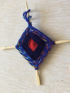 Made by B.Gernitz
Extension: students may subsequently make a combined warm and cool colored Woven Gods Eye as seen in this sample image, whereby I used chopsticks combined with red (warm), blue violet (cool) and blue with red, yellow and teal (combined warm & cool) yarn:
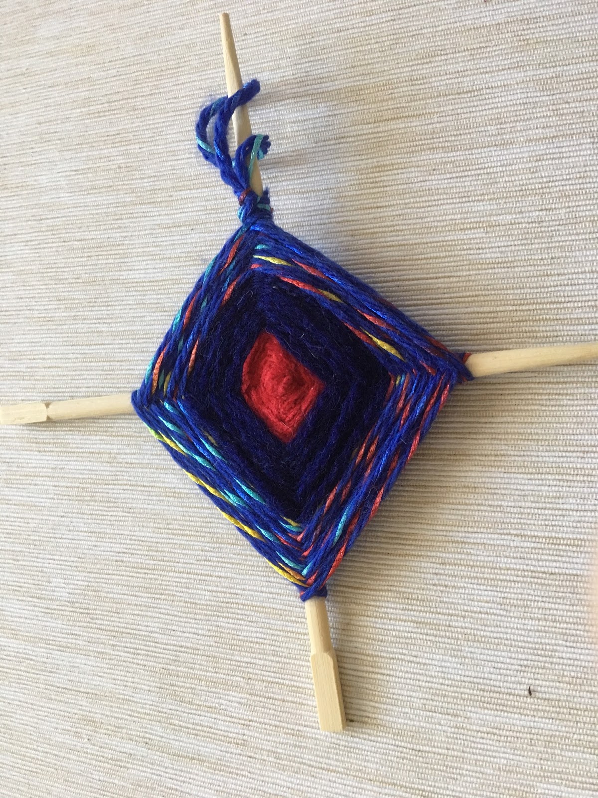 Made by B.Gernitz
Pastel Artwork
Assignment-Warm or Cool Color scheme 2-3 classes - 60mins each


After learning about the Warm and Cool Color theory, and observing warm
and cool artworks from professional artists, as well as, student sample
artworks, the class will explore their color theory knowledge and
understanding, and also practice their skills as follows:
- Have students brainstorm ideas for their
subject matter or abstract design to make either a Warm OR Cool pastel
artwork.
- Students sketch 1-2 idea drafts in
pencil of their subject/design idea(s) and write name on paper.
- Next, students consider which color scheme
they want to use, Warm or Cool, to make their artwork.
- When students have chosen which color
scheme they want to use, they need to identify which specific colors they
will use to create their warm (red, orange, yellow) or cool (blue, green,
purple) artwork and write them on their sketch as part of their plan.
- Then students explore/practice using warm
or cool colored pastels on the back of their sketched paper(s) using the blending
techniques shown. Teacher circulates to provide further assistance as
needed.
- When they have completed the above,
students submit for review their sketch and chosen color scheme into class
bin, before beginning their final warm/cool pastel artwork to be continued next class.
- Next
class, using their sketch with feedback, students will sketch their
subject/abstract design using light pencil outlines on a piece of mixed
media paper.
- Then, students use pastels to create their
Warm OR Cool artwork using blending techniques, together with tints (white),
tones (grey) and shades (black) of the proper colors for their chosen
color scheme. Teacher circulates. (Many students will complete over 2 classes, while others may need more time)
- Ensure
that all students write their full name and class number on the back of
all pages of their artwork(s) before passing into their class bin at the end of
each class.
- Extra for those students who complete their warm/cool artwork early; have them make a combined warm and cool artwork, as per sample artworks, using same techniques.
1. Becerir, B. (2017,
May 23). Color Concept in Textiles: A
Review. J Textile Eng Fashion Technol 1(6): 00039. DOI: 10.15406/jteft.2017.01.00039 Retrieved July 17, 2019
from https://pdfs.semanticscholar.org/2276/43523ea331ffcbaaaf54cee2daa3f3f4a915.pdf
2. Morton, J.L.
(1995-2019). Color Matters: Color & Design.
Retrieved July 17, 2019 from https://www.colormatters.com/color-and-design/basic-color-theory
3. Maxxor (2019). The
importance of color in design. Retrieved
July 19, 2019 from https://www.maxxor.com/blog/the-importance-of-colour-in-design/
4. Braque, G. (2019). Houses at L’Estaque. Retrieved July 20, 2019 from http://www.georgesbraque.net/houses-at-l-estaque/
5. Maxxor (2019). The
importance of color in design. Retrieved
July 19, 2019 from https://www.maxxor.com/blog/the-importance-of-colour-in-design/
Sources
1. Becerir, B. (2017,
May 23). Color Concept in Textiles: A
Review. J Textile Eng Fashion Technol 1(6): 00039. DOI: 10.15406/jteft.2017.01.00039 Retrieved July 17, 2019
from https://pdfs.semanticscholar.org/2276/43523ea331ffcbaaaf54cee2daa3f3f4a915.pdf
2. Braque, G. (2019). Houses at L’Estaque. Retrieved July 20, 2019 from http://www.georgesbraque.net/houses-at-l-estaque/
3. Google image of
Color Wheel adapted by Gernitz, B. (2014). Color Wheel. Taken from B.Gernitz’s
Color Theory Lesson. Irretrievable July 17, 2019 from
www.himinteriordesign.com or via Google images.
4. Google image of
Complementary color wheel. Retrieved
July 17, 2019 from
5. Google image of
Split Complementary color wheel. Retrieved July 17, 2019 from
6. Maxxor (2019). The
importance of color in design. Retrieved
July 19, 2019 from https://www.maxxor.com/blog/the-importance-of-colour-in-design/
7. Morton, J.L.
(1995-2019). Color Matters: Color & Design.
Retrieved July 17, 2019 from https://www.colormatters.com/color-and-design/basic-color-theory
8. Google image of Warm – Christina W’s Warm hands - Taken from B.Gernitz Gr 7 Color theory lesson (2014). Irretrievable July 21, 2019
http://immaculateheartacademy.org/outside2/art/artwebsitefiles/GALLERIES/Intro%20Green%20Completed%20Web%20Page/WChristina%20Web%20Gallery-%20fixed%20by%20Encke/images/art%20web%20gallery.htm
9. Google image of Cool – Georgia O’Keefe flowers - Taken from B.Gernitz Gr 7 Color theory lesson (2014). Retreived July 21, 2019 http://wpesart.wordpress.com/2012/09/
10. Google image of Warm & Cool Sun & Moon Artwork - Taken from B.Gernitz Gr 7 Color theory lesson (2014). Retreived July 21, 2019 http://creativemoon.co/?p=48
11. YouTube video of Red Ted Art's "How to Make a God's Eye Craft." Retreived June 16, 2020 https://www.youtube.com/watch?v=X53ZXcHoR_c
11. YouTube video of Red Ted Art's "How to Make a God's Eye Craft." Retreived June 16, 2020 https://www.youtube.com/watch?v=X53ZXcHoR_c
No comments:
Post a Comment